Top on my
list of interior room design schemes that brings out the romantic in me is the
bedroom. While some constraint must be exercised in a home’s public spaces,
those design rules need not apply in the bedroom. It’s a private oasis, an
inner sanctum that few are given entrée and so gives license for complete
personal expression. A bedroom can exude your character and personality,
designed any way you want.
So
although general rules of design don’t apply, there are certain key elements to
include that will achieve the perfect retreat for relaxation and renewal, not
just for sleeping.
A
soft, warm rug to greet your feet
when first getting out of bed mornings is far more pleasant than stepping onto
a cold, hard floor. Wall to wall carpeting is one option, but many of my
clients prefer to maintain continuity and install stone or wood flooring
throughout their homes. One solution is the addition of an area rug that
creates a neat border around the bed, although ¾ of it is under the bed, thus lost
from view. A less expensive and more practical alternative are runners or small
area rugs placed on each side of the bed. This choice is also preferable if you
plan to use a bench at the foot of the bed.
Clients
who opt for a single area rug often make the mistake of purchasing one that’s
too large. A border of 30-36” is all that’s needed on the bed’s sides and foot
end. It should reach up to the night stands without extending under them. It
gives the arrangement a trim, more contemporary look.
Wasted
space is one of the biggest bedroom design issues. With the availability of
building well-outfitted closets, and purchasing night stands with drawers,
there's no need for traditional bedroom furniture - dressers, armoires, and the
like. By eliminating these oversized, unnecessary case goods, There’s plenty of
space available to create a cozy conversation/reading
area or add a desk/vanity.
Night tables flanking
the bed are a must for storage, and easy access for things needed during the course
of an evening. I place an alarm clock, note pad and pen for midnight
inspirations, a coaster for a glass of water on top, and keep a box of tissues,
book, flashlight, remotes, and other necessities in a drawer. Reading lamps are
essential whether placed on the tables, or if space I want to save space, I wall-mount
swing arm lamps or install recessed ceiling pinpoint lights with a bedside
switch.
Speaking
of lamps, layered lighting offers
total control of the bedroom’s atmosphere. All fixtures should be on dimmers. For
drama and romance, I love the look of a chandelier in the center of the
ceiling. A floor lamp or table fixture is needed to illuminate the desk or
reading area. Sconces would look charming flanking a mirror hung over a vanity
table.
The
purpose of window treatments is to
augment the bedroom’s design scheme or to
frame a beautiful view. Keep them simple
but interesting; they shouldn’t be a focal point. Choices are limitless. Some
options include drapery panels, shades, and shutters in fabrics, matchstick, or
wood. Choices depend on the style of the window and personal preference. If you
want the room to appear larger, opt for a color that blends with the wall, but use
textured or patterned fabrications to avoid the room from looking bland. Window
treatments in contrasting colors break up long stretches of walls of a large
room. Small windows can be made to appear larger; uneven windows can be
camouflaged to look symmetrical. Blackout shades need not be heavy or
cumbersome for light control. Light weight shades provide complete darkness,
and roll up out of sight when unneeded.
If I were to have a signature
element, something I use consistently in every interior design
project, it’s a
mirror. I believe almost every room should
have one, if not for checking out your image, but for reflecting a beautiful
view, reflecting light, adding a sense of space and sparkle to a room. Standing
screens, decorative or fully mirrored, can be moved anywhere, and are very
effective in brightening a dark corner.
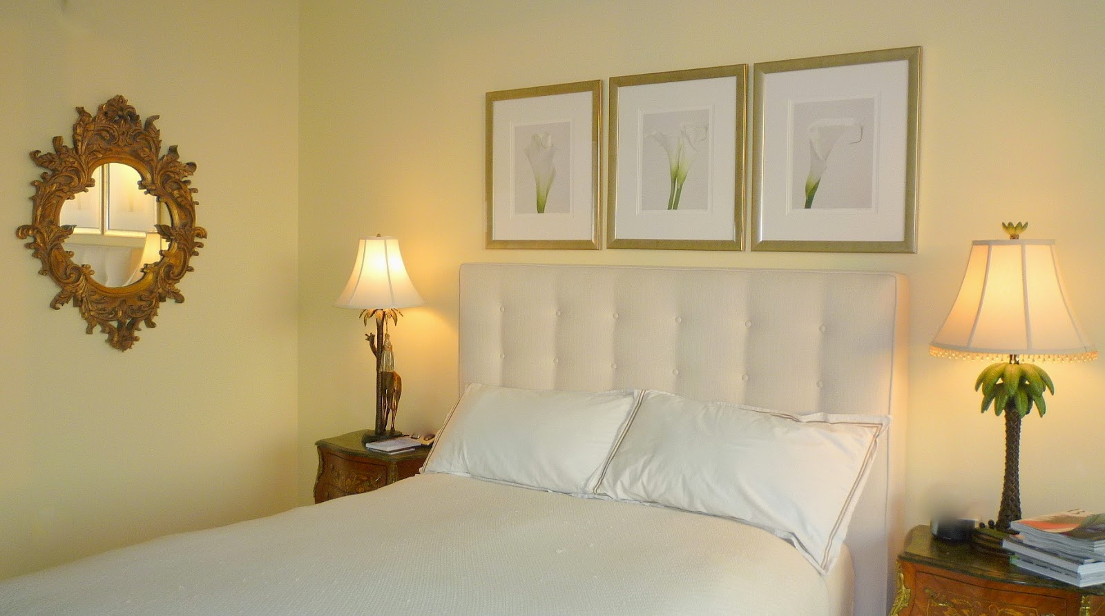
Upholstered
headboards work for any interior
design style. They add a feeling of soft luxury to the room. For a cohesive and
trim look, I like to have the headboard and box upholstered in the same fabric,
and avoid using a dust ruffle. Tufted textured fabric adds interest and is both
tailored and elegant. Leather is masculine while jacquards and prints
are more feminine.
This brings us to color. Both
body and mind need rest and the opportunity to unwind. One
way to achieve both
is a space for the eyes to gaze in a quiet way, moving gently around the space
without anything jarring to interrupt the flow. I use few colors in bedrooms.
For walls, I use colors like the soft, mellow yellow of the sun, the blue of
the gentle movement of water, rolling hills of lavender, or vast fields of lazily
swaying stalks of wheat. Perhaps wallpaper in a soft toile, a tone on tone
stripe, or diamond pattern in calming earth tones. All provide soothing and restful
images.
Regardless of the design scheme
or color palette, I use bed linens in shades that range from pure white to
creamy ivory. White, yes… bland, no! Textural interest, colorful taping or
embroidery, passementerie, and other unique touches add a beautifully custom
look.
A bedroom is your private domain.
It is here where design expresses its greatest value and supports our deepest
needs.